This video below is me colouring a storyboard drawing from an old job. Working under job conditions means I stopped drawing when the deadline stopped. Sometimes I like to revisit old drawings like this and tune them up a bit, make them a bit nicer.
I used Photoshop on the computer using a Wacom Cintiq for the digital line for both versions as well as the digital colour for the original version. However I used Procreate on the iPad to colour the new version on the train during my commute to work.
Procreate allows me to save a video of the colouring process which I’ve uploaded to YouTube here.
There’s no sound, recording voiceovers is a learning curve for another day.
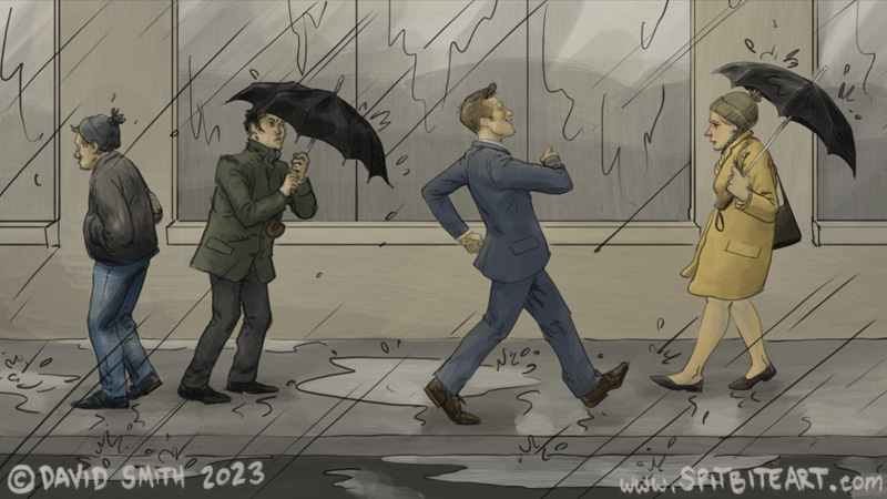
Our Hero
In this drawing we see Our Hero walking to work. He’s smiling and couldn’t be happier even though it is rainy and cold. He’s happy because he has the best job in the world. He works for Our Brand. Our Brand sells only the best consumer items and Our Hero helps choose these. We, the Buying Public can purchase with confidence!
To begin

The original was done in a now-deprecated older tv format, so first I re-sized and re-proportioned it to a more current 16:9.

It was finished enough that I could draw the new version straight over it without needing to re-think the figures or the space. When I re-draw old job pictures I prefer to keep the layout as per the Art Director’s original vision. The more I might alter it the less it would represent an actual turned-in-and-paid-for job.
Unforced errors, Photoshop trips me up
My single most common and persistent error is drawing or erasing on the wrong layer.

I name my layers as per good practice, so this shouldn’t happen. Mostly this is completely my own doing. However Photoshop has a little booby-trap that makes it worse and trips me up constantly. When I undo the first mark I’ve made on a layer Photoshop also includes having selected that layer in the undo. It then returns me to the previous layer IN THE SAME UNDO and without telling me. If I don’t catch this I then continue drawing ON THE WRONG LAYER.
This isn’t a bug, it’s a deliberate Adobe design choice and there is a logic to it. I just would prefer a different logic. I think selecting a layer should count as a separate History Step. This extra step is really, really easy to miss if I’m undoing multiple history steps at a time. I have Photoshop set to the default of 20 history states and this mistake becomes baked-in if I don’t realise before new mark no 21.
A locked, half-opaque barrier layer between the underdrawing and the new line layer helps mitigate this. Another thing I do to mitigate is tap the Eraser multiple times on an empty part of a newly selected layer. This builds a small reserve of unimportant history states so I am more likely to stop pressing ‘undo’ before I get to the layer change step.
Back to the drawing.

Once the line is done it’s over to Procreate to begin adding colour. Adding colour to the background first helps define the space and the atmosphere and makes it easier to balance the figure colours. This picture depicts a rainy day in Britain and/or Ireland so I kept the palette subdued.

Colouring digitally gives a wonderful freedom to use energetic, broad brushstrokes without having to keep within the lines every time. Erasing back to the line defines the form and always gives a satisfying little reveal. I like to work like this.
My Client’s Client
The purpose of Storyboarding is ultimately to describe something not to my client, but to my client’s client and I can’t just amuse myself putting in whatever I want.

If I were to add, say, a piece of wall decoration or a piece of architecture to the picture my client’s client might reasonably assume that this same detail will be present in the final delivered advertisement.
This can create a problem that doesn’t need to exist. So for storyboards it is important not just what I do put in the picture but what I don’t put.
Colour choices, dressing the scene

Dressing a scene can be really tricky. People in Britain and Ireland tend to wear really a lot of dark colours and too many can leave the the picture depressing or just dull. Too many bright colours can then interfere with the description the picture is giving.

Here for the girl’s coat I want to break the monotony of many people all wearing dark colours. I love bright colours like this turquoise and if left to my own devices I might use it just to amuse myself. However it draws focus away from Our Hero and it has to go.

I like the orange hat too but again, it distracts from Our Hero. Back to sensible brown we go.

This yellow-beige-camel-whatever colour coat lightens the picture without becoming a distraction and is a better fit. Placing this scene-brightener on the side that Our Hero is facing towards adds to the feeling of him walking towards brighter horizons without having to alter the lighting of the scene.
Alternate versions

My favourite thing about Procreate is that it allows me to save a video of the picture as I work on it.
I love this ability, it gives me perspective on my own working process and helps me learn.
Working digitally also allows me to work in layers and view them in isolation or exaggerated or out of context. These alternate versions are the inner workings. They are like seeing the engine of a car, or behind the scenes at a theatre.
They fascinate me endlessly and I often save them as separate pictures.
Finishing up, balancing
Earlier on I fit the figures to the background, towards the end I fit the background back to the figures.
Video
Click on the picture or on this link to open the video in YouTube.
There’s no sound, recording voiceovers is a learning curve for another day.